|
There are two new baby calves on the farm--Birdsong Princess Alexandra (born May 30, 2014) and Birdsong Golden Buttercup (born July 13, 2014)—and over the next few months I am going to write a series of blog posts about tattooing, tagging, and registering a calf with Jersey Canada, with Alexandra and Buttercup as my models.
When registering a calf with Jersey Canada, you are required to tattoo or tag her first. I tattoo and tag, but both are not required and many dairy farmers choose to tag but not tattoo. I choose to tattoo because tags can get lost, plus it's a lot harder to tamper with a tattoo than with a tag! I tattoo my calves when they are between one and three weeks of age. I don't like to tattoo earlier than one week because I want to give my calves a chance to "get on their feet" first, or after three weeks because the calves are harder to restrain. Register your herd tattoo letters Before you start doing any tattooing, you are required to register your herd tattoo letters with Jersey Canada for $5 plus tax. Your herd tattoo letters are three or four digits that are tattooed in the right ear of every calf that you register. This tattoo will identify you as the owner of the calf when she was born. For example, if you buy a bred cow and register her calf, you will tattoo the calf with your herd tattoo letters, not the herd tattoo letters of the previous owner. You can choose letters or letters and numbers for your herd tattoo, and often farmers will choose their initials or the initials of their farm name. For example, I registered my initials, NKF, as my herd tattoo while my friend Melanie Guttner from Butterkup Farms in Pink Mountain, BC registered her farm initials, BKF, as her herd tattoo. But you aren't limited to initials—I found Jersey farmers with COW and MOO registered as their herd tattoo letters! Purchase your tattoo kit The two brands of livestock tattoo equipment that I am aware of are Ketchum and Stone. I ordered my tattoo kit from Valley Vet Supply in Marysville, Kansas. They've got a great mail-order catalogue and good prices. You will want to buy the following items for your tattoo kit: Tattoo pliers When I researched my options for tattoo pliers, I really liked the look as well as the price of the Stone brand, and the positive ear release was a big plus for me. Stone sells 3/16 inch, 5/16 inch, and 3/8 inch tattoo kits (that's the size of the tattoo digits); the 3/8 inch kit is your best choice for tattooing calves. I wanted to keep my herd tattoo letters in my pliers all the time, so ordered the 3/8 inch revolving head tattoo kit. I'm glad I did, because it makes tattooing a breeze—no switching digits between ears, no searching for lost digits in the grass or hay, and no tattooing errors because I reversed the digits by mistake. Complete alphabet set (A-Z) You can buy your tattoo letters one by one, but it's a lot cheaper (15% cheaper before adding postage costs) to buy a complete set. Remember to match your tattoo digit size to your plier size, or they will not fit. For example, if you buy 3/8 inch pliers, you'll want to buy 3/8 inch digits. Complete number set (0-9) You can buy your tattoo numbers one by one as well, but again, it's a lot cheaper to buy a complete set. My tattoo pliers already came with a complete number set, like all of the Stone tattoo kits from Valley Vet Supply. Extra tattoo digits If you want to keep your herd tattoo in your pliers all the time, you might want to buy an extra set of the letters (or letters and numbers) that are registered as your herd tattoo letters. I ordered an extra N, K, and F for my herd tattoo letters. If you think you'll be tattooing a lot of calves (or goat kids ) you may want to buy a couple extra numbers as well. I ordered an extra 1 and 2, and with these two extra digits I can tattoo as high as 32! (So far I've never tattooed higher than 2 with my Jerseys and 4 with my Nubians.) Tattoo ink You can buy tattoo ink in black, green, or white, and as a liquid, paste, or roll-on. Green is your best choice because it is visible in both dark and light ears. My tattoo kit came with black liquid tattoo ink like all of the Stone tattoo kits from Valley Vet Supply, but I ordered green roll-on ink as well and really like it because there are no messy spills and the ink will not dry out between calves. Soft cloth or paper towel You will want to clean your calf's ears before you start tattooing. Paper towels are fine, but I like the microfiber dairy towels wet with plain water because they are so soft and remove 99% of bacteria, plus I can rewash them for the next calf. Antiseptic/disinfectant You will want to clean your calf's ears with an antiseptic before you tattoo, and will want to clean your tattoo digits with a disinfectant both before and after tattooing. Cotton balls or pads I pour a little antispetic/disinfectant on cotton balls or pads to clean my calf's ears and the tattoo digits and kill any bacteria. Soft toothbrush You might want to buy a soft toothbrush to rub the ink in the tattoo you've made. Sponge A sponge works really well for cleaning your tattoo digits when you're finished. Storage box You can buy fancy storage boxes for your tattoo kit, but I purchased a clear 4 liter Really Useful Box from Staples instead and my brothers cut me a piece of 1 inch rigid foam insulation to store my tattoo digits in. It was a lot cheaper and I'm really happy with it. 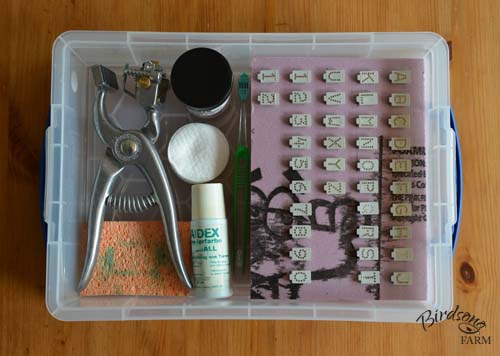
Prepare your tattoo equipment
Find your herd tattoo letters and insert them in your tattoo pliers. Since you tattoo your herd letters in your calf's right ear, I highly recommend that you insert the digits starting from the left side for a crisp, clear tattoo; if you insert the digits starting from the right side the tattoo will be closer to the outside of the ear and not as nice. Remember to insert the digits backward as well; I inserted my herd tattoo letters, NKF, as FKN. When you are finished, check for mistakes by tattooing a piece of heavy paper first. I never take my herd tattoo letters out of my pliers, but I still double check them every time I tattoo 'cause it's a lot easier to fix a mistake before I start doing any tattooing! 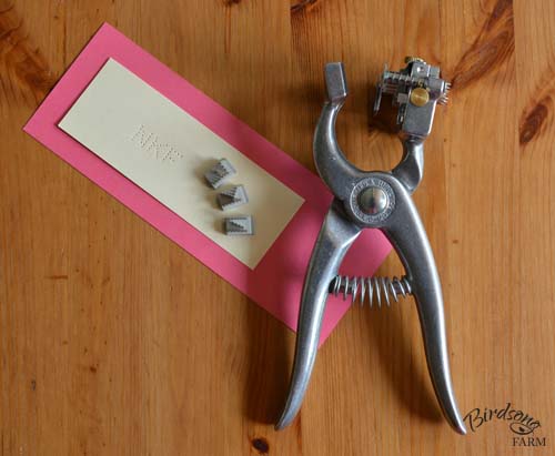
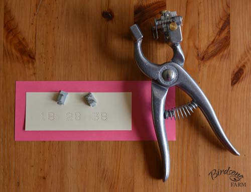
Next, choose your animal number and the year letter and insert them in the other side of your tattoo pliers. Since you tattoo your animal number and the year letter in your calf's left ear, I highly recommend that you insert the digits starting from the right side for a crisp, clear tattoo.
The year letter is assigned by Jersey Canada, and the letter for 2014 is 'B'. You will tattoo the first calf that you register in 2014 with 1B, the second calf with 2B, and the third calf with 3B. For example, Alexandra is tattooed with NKF in her right ear and 1B in her left ear, and Buttercup is tattooed with NKF in her right ear and 2B in her left ear. The year letter for 2015 is 'C', so next year you will tattoo your calves as 1C, 2C, 3C... The letters I, O, Q, and V are not designated as year letters, so the rest of the letters in the alphabet are repeated every 22 years. For example, you will find animals tattooed with the letter 'B' in 1992, 2014, and again in 2036. 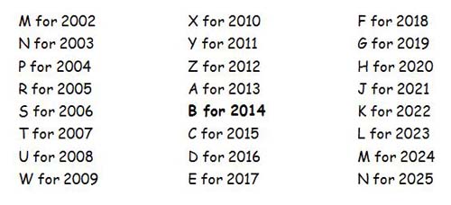
Remember that you will want to insert the digits backward again (1B will be inserted as B1), and when you are finished check for mistakes by tattooing a piece of heavy paper first.
After you've checked (and maybe double checked ) your herd tattoo letters and the animal number/year letter, it's time to clean the tattoo digits with your disinfectant of choice. Now you're ready to tattoo your first calf!
This is the first post in a two-part series about how to tattoo your Jersey calf; please click here to read the second post. 
0 Comments
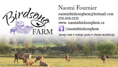
I've had my farm logo for about eight months now, so I thought that it was time to get business cards printed. There are various pre-designed business cards available (the type where you choose a design and then add your logo and type in your name, address, and phone number), but I wasn't really happy with any of the options...so I had my business cards custom designed by Pure Graphics in Enderby. (Pure Graphics is the business that designed my farm logo; please click here to read about that story.)
Naturally, I wanted my business card to feature my lovely new logo, and I wanted my name, email address, phone number, website, and Facebook page listed on the card as well. I thought that it might be nice to add my farm quote (We don't inherit the land from our ancestors. We borrow it from our children.), plus a list of what the farm offers (Jersey cows, Nubian goats, and cheese making workshops).
Becky Shuert, the owner of Pure Graphics, asked if I wanted a photo on the card as well, maybe as a background. That hadn't even crossed my mind, so Becky let me look through a binder filled with other business cards that she had designed for ideas. I liked the look of the business cards that had a background photo, so promised her that I would send her two or three of my favourite farm photos. When I got home later that day, I emailed her my favourite photo of Daisy as well as my favourite photo of the cows out on pasture. Holly Kormany was the graphic designer who worked on my project, and about a week later I received an email from her with the first proof. It featured five business cards to give me a bit of an 'idea board' that I could work from: 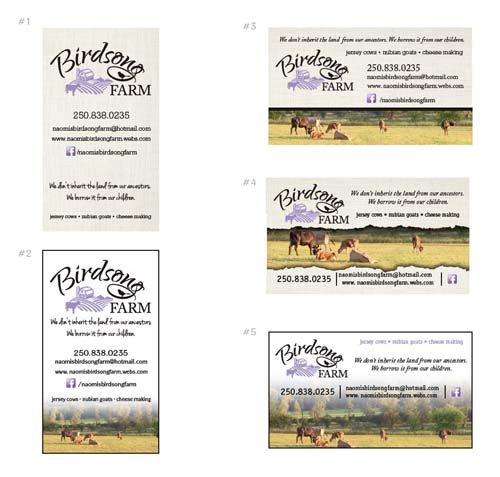
I was so impressed with all the designs that I actually squealed when I opened the email! It was hard to choose, but I went with design #5 because I liked it the best.
I didn't like how Princess Sonja's rump was cut off, so I asked Holly to change that. I asked her to add my name to the card as well, and switch the quote and list of what the farm offers around. 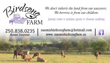
After receiving the next proof, I asked Holly to make my name larger and my phone number smaller, and add the link for my Facebook page. Holly recommended removing the quote to keep the business card from being too crowded, and shifting the layout around a little as well. This was the result:
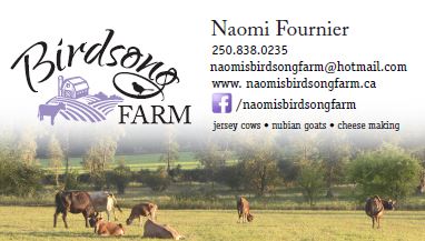
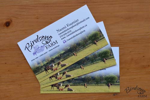
I was happy with the new look of my business card, but requested that Holly switch my phone number and email address around. Email is the best way to get in touch with me, so I wanted to encourage that by listing my email address first. I asked Holly to change 'cheese making' to 'cheese workshops' as well.
I was almost happy with my business card, but thought that the card looked a little heavy with the extra text on the right side. So I asked Holly to take the list of what the farm offers and put it under the logo instead.
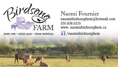
She did that, and changed the bullets from black to purple as well 'cause she thought it looked better that way. I agreed with her, and was very happy with that design. My new business card was finished!
Pure Graphics offers printing services, but in the end I ordered 500 business cards, printed on matte paper, from Staples Copy & Print. I think my new business cards look amazing, and am very happy that I paid the excellent graphic designers at Pure Graphics to design it.
 If you raise registered dairy cattle or want to research your new family cow, you should check out the Canadian Dairy Network. This amazing website is where you can search for the registrations and records of eight breeds of dairy cattle: Ayrshire, Brown Swiss, Canadienne, Guernsey, Holstein, Jersey, Milking Shorthorn, and Norwegian Red. In this blog post, I'm going to guide you as you learn about searching for records, with my registered Jerseys as the models.
This is the second installment of a two-part series about designing Birdsong Farm's logo, so if you are curious about how the story started, you can read the first post here.
I received another email from Holly at the end of August with a new logo proof. She had taken out the second silo, added a calf beside the cow, and given me a few bird styles to choose from: 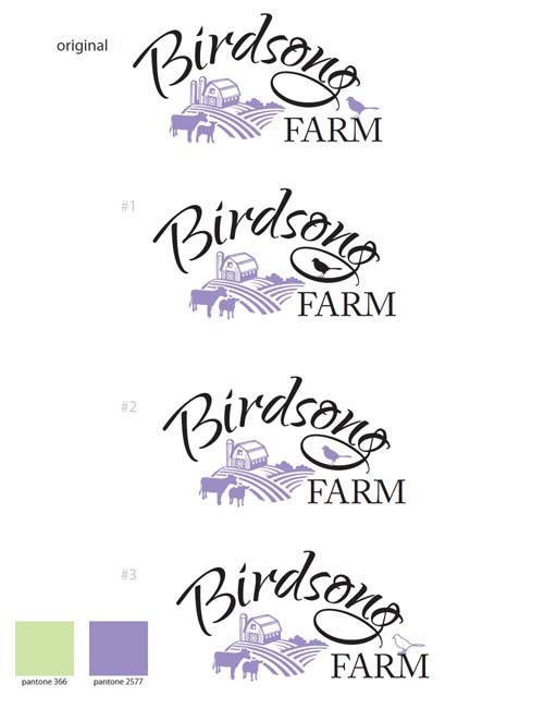
I really loved logo #1, and thought that the black bird in the loop of the 'g' on 'Birdsong' was eye catching. I wasn't happy with the calf, so asked Holly if she could switch it back to one cow, but leave the cow where she was standing and add an extra furrow to the field to fill the white space instead. My mum thought that the logo might look better if the bird's feet were touching the loop of the 'g' as well.
It was about two weeks later when I received two emails from Holly. The first one featured a cow with two furrows added where the calf was: 
The second email featured a cow with one furrow added:
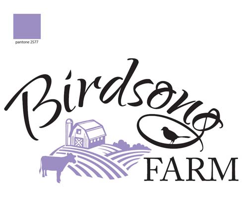
My family and I really liked the second logo, and we were so happy with it that it became Birdsong Farm's new logo.
After agreeing to the finished logo design, I received a final email from Pure Graphics about a week later saying that my files were ready for me. The disk had several versions of my lovely new logo on it: the full colour black and purple version, plus an all black and all purple version, as well as white and purple, all purple, and all white logos on a black background. All six versions came in both .jpg and .pdf files (as well as the original .ai files), and I was given a sheet that showed all of the colour variations as well as the details of the purple colour we chose on the Pantone and CMYK colour scales and the names of the two font styles in the logo: 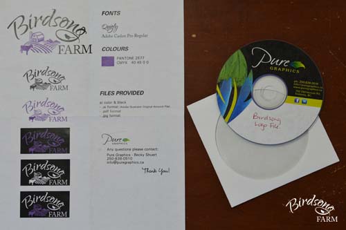
It took about three months to design the logo from start to finish. Originally I had hoped to finish it in time for the 2013 Armstrong IPE at the end of August, but after we started the design process I decided that I wanted to take my time and get a logo that I would be happy with forever.
After my new logo was finished, I had an address stamp made. Now I guess the next projects on my list will be designing business cards, farm brochures...and fancy new signs for the 2014 Armstrong IPE. 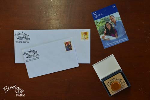
Ever since Birdsong Farm was founded on July 15, 2008, I've wanted to design a logo for the farm. Five years later--in 2013--I finally did it!

I'm friends with a few graphic designers, but Pure Graphics in Enderby was my first choice because it is local, plus I've often admired Rebecca Shuert's work in the past. I am so happy that she agreed to work with me, and she and Holly Kormany did an excellent job!
My logo started out with a list. That's right! I've admired many lovely logos since I started my farm and knew what I did and did not like in a logo, but I still didn't really know what I wanted my logo to look like. Becky encouraged me to stop by her studio to talk about what I wanted, and so I finally took my list and paid her a visit. 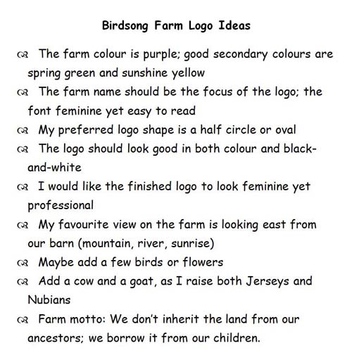
Becky and Holly worked their magic from here, and about a month later I received an email from Holly with a few ideas for me to think about:
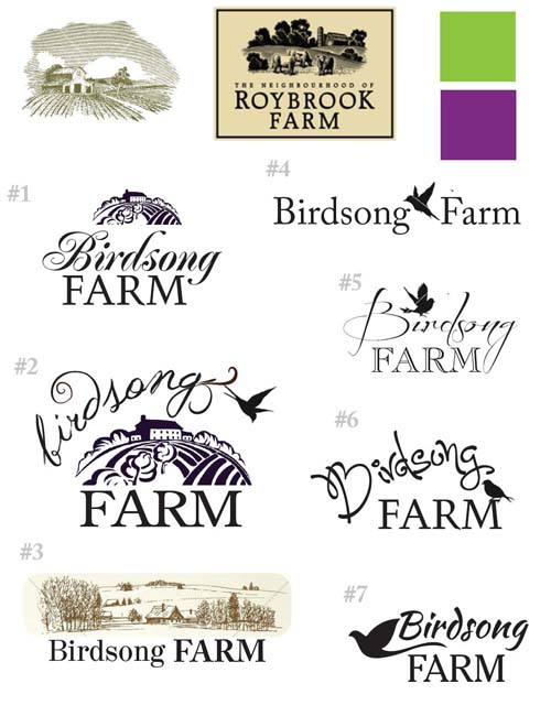
I surprised myself with the first logo proof because I really liked the woodcut style of logos #1 and #2, as well as the bird on logo #6—with a few changes of course. :) I wanted a gambrel style barn (my dream barn) with a silo, but didn't care for the fonts or colours, so when I visited Pure Graphics again Becky and I chose another shade of green and two new shades of purple. The one shade of purple was my choice, and the other one was Becky's; the purple that is featured on my logo today is the colour that Becky chose.
I received a second email from Holly about a month later, and this time she focused on various layouts, colour schemes, font styles, and bird designs: 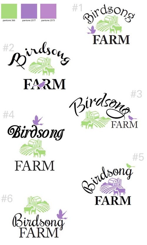
My first choice was logo #3 as I really liked the offset oval style, but logo #1 was a close second. The 'Birdsong' on logo #1 features one of my font recommendations, but in the end I found that I liked the font on logo #3 better; that is the font featured on my logo today.
We decided to reverse the purple and green colours on logo #3, and I thought that the goat looked like a sheep, so I asked if we could try the logo with a single cow instead. About two weeks later I received a third email from Holly, and this time she had played around with colour variations: all green, all purple, purple with a green bird, and green with a purple bird...and a logo with one cow and no goat: 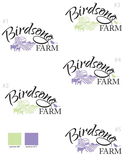
I liked the all purple logos, #1 and #5, the best. My mum thought that maybe a bird outline would be nicer than a coloured bird, and we didn't really like the solitary cow so I asked if Holly could add a second animal back in, but make it a calf instead of a goat. I wanted to delete one of the silos as well, and left it in her capable hands.
This is the first installment of a two-part series about designing Birdsong Farm's logo, so if you are curious about how the story ended, you can read the second post here.
|