|
Ever since Birdsong Farm was founded on July 15, 2008, I've wanted to design a logo for the farm. Five years later--in 2013--I finally did it!
I'm friends with a few graphic designers, but Pure Graphics in Enderby was my first choice because it is local, plus I've often admired Rebecca Shuert's work in the past. I am so happy that she agreed to work with me, and she and Holly Kormany did an excellent job!
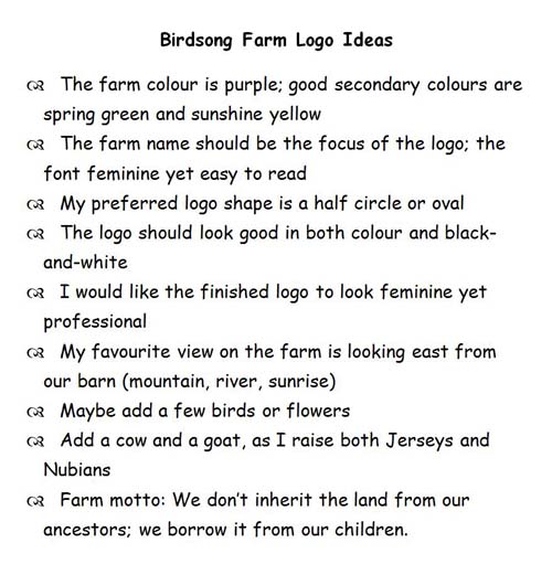
My logo started out with a list. That's right! I've admired many lovely logos since I started my farm and knew what I did and did not like in a logo, but I still didn't really know what I wanted my logo to look like. Becky encouraged me to stop by her studio to talk about what I wanted, and so I finally took my list and paid her a visit.
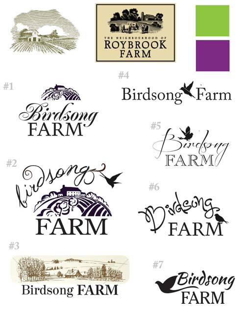
Becky and Holly worked their magic from here, and about a month later I received an email from Holly with a few ideas for me to think about:
I surprised myself with the first logo proof because I really liked the woodcut style of logos #1 and #2, as well as the bird on logo #6—with a few changes of course. :) I wanted a gambrel style barn (my dream barn) with a silo, but didn't care for the fonts or colours, so when I visited Pure Graphics again Becky and I chose another shade of green and two new shades of purple. The one shade of purple was my choice, and the other one was Becky's; the purple that is featured on my logo today is the colour that Becky chose.
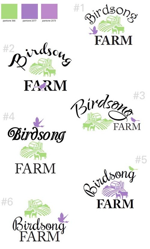
I received a second email from Holly about a month later, and this time she focused on various layouts, colour schemes, font styles, and bird designs:
My first choice was logo #3 as I really liked the offset oval style, but logo #1 was a close second. The 'Birdsong' on logo #1 features one of my font recommendations, but in the end I found that I liked the font on logo #3 better; that is the font featured on my logo today.
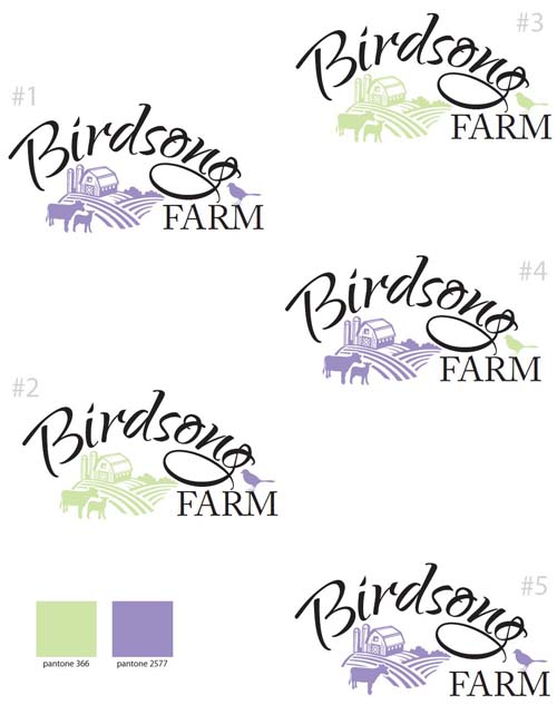
We decided to reverse the purple and green colours on logo #3, and I thought that the goat looked like a sheep, so I asked if we could try the logo with a single cow instead. About two weeks later I received a third email from Holly, and this time she had played around with colour variations: all green, all purple, purple with a green bird, and green with a purple bird...and a logo with one cow and no goat:
I liked the all purple logos, #1 and #5, the best. My mum thought that maybe a bird outline would be nicer than a coloured bird, and we didn't really like the solitary cow so I asked if Holly could add a second animal back in, but make it a calf instead of a goat. I wanted to delete one of the silos as well, and left it in her capable hands.
This is the first installment of a two-part series about designing Birdsong Farm's logo, so if you are curious about how the story ended, you can read the second post here.
0 Comments
Your comment will be posted after it is approved.
Leave a Reply. |
Categories
All
Archives
January 2020
|


