|
This is the second installment of a two-part series about designing Birdsong Farm's logo, so if you are curious about how the story started, you can read the first post here.
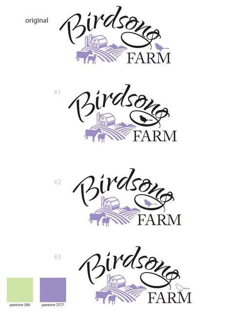
I received another email from Holly at the end of August with a new logo proof. She had taken out the second silo, added a calf beside the cow, and given me a few bird styles to choose from:
I really loved logo #1, and thought that the black bird in the loop of the 'g' on 'Birdsong' was eye catching. I wasn't happy with the calf, so asked Holly if she could switch it back to one cow, but leave the cow where she was standing and add an extra furrow to the field to fill the white space instead. My mum thought that the logo might look better if the bird's feet were touching the loop of the 'g' as well.
It was about two weeks later when I received two emails from Holly. The first one featured a cow with two furrows added where the calf was:
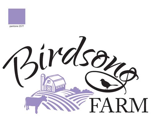
The second email featured a cow with one furrow added:
My family and I really liked the second logo, and we were so happy with it that it became Birdsong Farm's new logo.
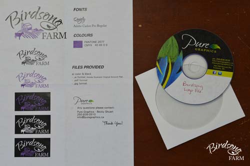
After agreeing to the finished logo design, I received a final email from Pure Graphics about a week later saying that my files were ready for me. The disk had several versions of my lovely new logo on it: the full colour black and purple version, plus an all black and all purple version, as well as white and purple, all purple, and all white logos on a black background. All six versions came in both .jpg and .pdf files (as well as the original .ai files), and I was given a sheet that showed all of the colour variations as well as the details of the purple colour we chose on the Pantone and CMYK colour scales and the names of the two font styles in the logo:
It took about three months to design the logo from start to finish. Originally I had hoped to finish it in time for the 2013 Armstrong IPE at the end of August, but after we started the design process I decided that I wanted to take my time and get a logo that I would be happy with forever.
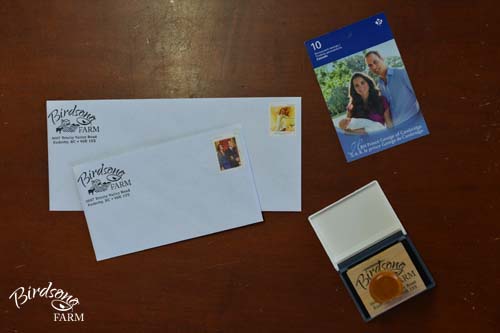
After my new logo was finished, I had an address stamp made. Now I guess the next projects on my list will be designing business cards, farm brochures...and fancy new signs for the 2014 Armstrong IPE.
0 Comments
Your comment will be posted after it is approved.
Leave a Reply. |
Categories
All
Archives
January 2020
|


