|
Did you wear red on Tuesday, June 10, 2014? Our whole family was wearing red that day in memory of the three RCMP officers who were killed in Moncton, New Brunswick on Friday, June 6, 2014: Constable Douglas James Larche, Constable David Joseph Ross, and Costable Fabrice Georges Gevaudan.
Here are a few family pictures that we took that day: 
Dad & Mum
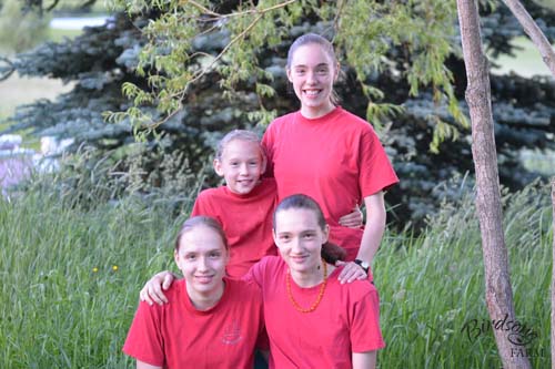
The Four Girls
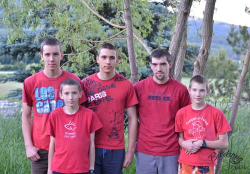
The Five Boys

0 Comments
I've had my farm logo for about eight months now, so I thought that it was time to get business cards printed. There are various pre-designed business cards available (the type where you choose a design and then add your logo and type in your name, address, and phone number), but I wasn't really happy with any of the options...so I had my business cards custom designed by Pure Graphics in Enderby. (Pure Graphics is the business that designed my farm logo; please click here to read about that story.)
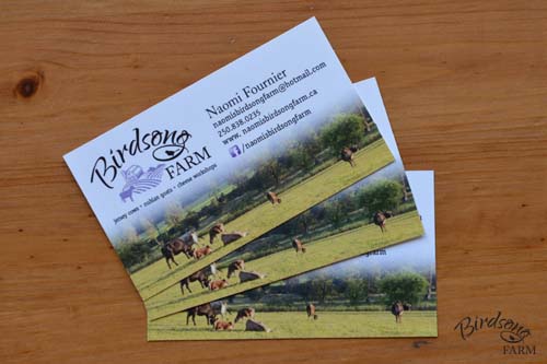
Naturally, I wanted my business card to feature my lovely new logo, and I wanted my name, email address, phone number, website, and Facebook page listed on the card as well. I thought that it might be nice to add my farm quote (We don't inherit the land from our ancestors. We borrow it from our children.), plus a list of what the farm offers (Jersey cows, Nubian goats, and cheese making workshops).
Becky Shuert, the owner of Pure Graphics, asked if I wanted a photo on the card as well, maybe as a background. That hadn't even crossed my mind, so Becky let me look through a binder filled with other business cards that she had designed for ideas. I liked the look of the business cards that had a background photo, so promised her that I would send her two or three of my favourite farm photos. When I got home later that day, I emailed her my favourite photo of Daisy as well as my favourite photo of the cows out on pasture. Holly Kormany was the graphic designer who worked on my project, and about a week later I received an email from her with the first proof. It featured five business cards to give me a bit of an 'idea board' that I could work from: 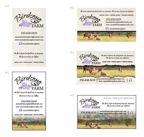
I was so impressed with all the designs that I actually squealed when I opened the email! It was hard to choose, but I went with design #5 because I liked it the best.
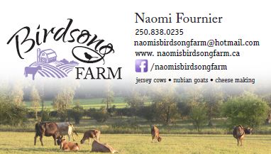
I didn't like how Princess Sonja's rump was cut off, so I asked Holly to change that. I asked her to add my name to the card as well, and switch the quote and list of what the farm offers around. 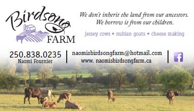
After receiving the next proof, I asked Holly to make my name larger and my phone number smaller, and add the link for my Facebook page. Holly recommended removing the quote to keep the business card from being too crowded, and shifting the layout around a little as well. This was the result:
I was happy with the new look of my business card, but requested that Holly switch my phone number and email address around. Email is the best way to get in touch with me, so I wanted to encourage that by listing my email address first. I asked Holly to change 'cheese making' to 'cheese workshops' as well.
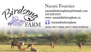
I was almost happy with my business card, but thought that the card looked a little heavy with the extra text on the right side. So I asked Holly to take the list of what the farm offers and put it under the logo instead.
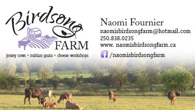
She did that, and changed the bullets from black to purple as well 'cause she thought it looked better that way. I agreed with her, and was very happy with that design. My new business card was finished!
Pure Graphics offers printing services, but in the end I ordered 500 business cards, printed on matte paper, from Staples Copy & Print. I think my new business cards look amazing, and am very happy that I paid the excellent graphic designers at Pure Graphics to design it.
Do you remember Jersey Canada's fun youth photo contest last spring, when Anna's amazing picture of Daisy placed third out of fifty entries?
For this year's contest, youth between the ages of 9 and 21 were again asked to submit their favourite Jersey photos, and my sister Anna submitted this picture she took of our youngest sister Rhoda with BIRDSONG PRINCESS GRACE. 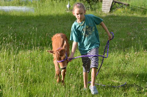
All of the entries were posted on the Jersey Canada Facebook page on Friday, and the winning photographs will be chosen by the number of 'likes' they receive. The contest ends on June 8th, and prizes will be awarded to the top three photos.
So please, click on this link https://www.facebook.com/media/set/?set=a.10152398068157618.1073741837.46252262617& and vote for Anna's picture by 'liking' it, and please ask your friends to vote too! June 8, 2014 Anna's photo of Grace and Rhoda placed 7th out of twenty three entries. Thank you to everyone who voted!
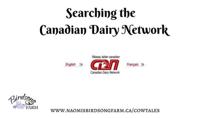 If you raise registered dairy cattle or want to research your new family cow, you should check out the Canadian Dairy Network. This amazing website is where you can search for the registrations and records of eight breeds of dairy cattle: Ayrshire, Brown Swiss, Canadienne, Guernsey, Holstein, Jersey, Milking Shorthorn, and Norwegian Red. In this blog post, I'm going to guide you as you learn about searching for records, with my registered Jerseys as the models.
This is the second installment of a two-part series about designing Birdsong Farm's logo, so if you are curious about how the story started, you can read the first post here.
I received another email from Holly at the end of August with a new logo proof. She had taken out the second silo, added a calf beside the cow, and given me a few bird styles to choose from: 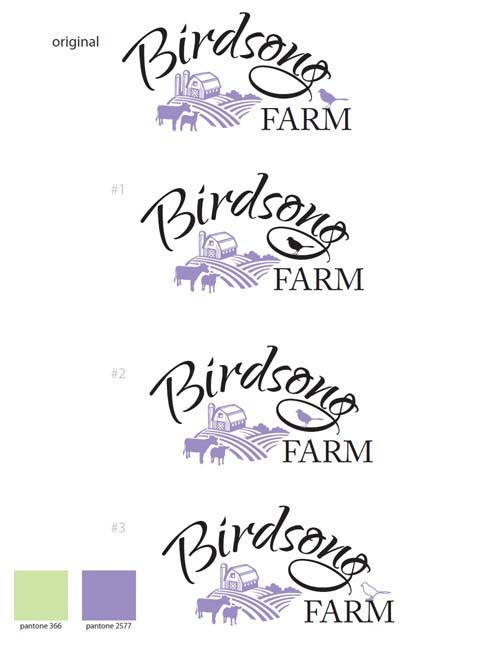
I really loved logo #1, and thought that the black bird in the loop of the 'g' on 'Birdsong' was eye catching. I wasn't happy with the calf, so asked Holly if she could switch it back to one cow, but leave the cow where she was standing and add an extra furrow to the field to fill the white space instead. My mum thought that the logo might look better if the bird's feet were touching the loop of the 'g' as well.
It was about two weeks later when I received two emails from Holly. The first one featured a cow with two furrows added where the calf was: 
The second email featured a cow with one furrow added:
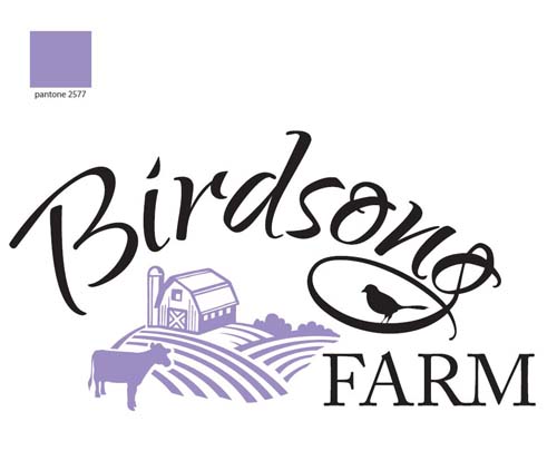
My family and I really liked the second logo, and we were so happy with it that it became Birdsong Farm's new logo.
After agreeing to the finished logo design, I received a final email from Pure Graphics about a week later saying that my files were ready for me. The disk had several versions of my lovely new logo on it: the full colour black and purple version, plus an all black and all purple version, as well as white and purple, all purple, and all white logos on a black background. All six versions came in both .jpg and .pdf files (as well as the original .ai files), and I was given a sheet that showed all of the colour variations as well as the details of the purple colour we chose on the Pantone and CMYK colour scales and the names of the two font styles in the logo: 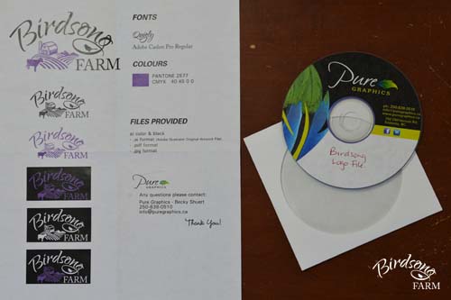
It took about three months to design the logo from start to finish. Originally I had hoped to finish it in time for the 2013 Armstrong IPE at the end of August, but after we started the design process I decided that I wanted to take my time and get a logo that I would be happy with forever.
After my new logo was finished, I had an address stamp made. Now I guess the next projects on my list will be designing business cards, farm brochures...and fancy new signs for the 2014 Armstrong IPE. 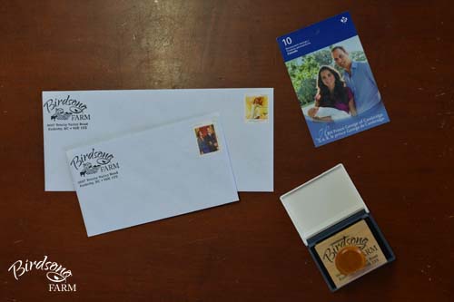
|